Designing a minimal website can be tricky. It’s not just about keeping things simple—you also have to make sure the site is practical and serves its purpose. That’s where a lot of people get stuck. Most minimal websites end up looking way too blank and often lack even the most basic features.
So, we’ve gone ahead and reviewed over 5,000 websites to bring you 16 of the best that are both beautiful and feature-rich.
What is minimal web design?
By the book, minimal design is all about keeping it simple—clean lines, basic shapes, and not going crazy with colors. But when it comes to web design, it’s not just about making things look neat. Your site still needs to be intuitive, practical, and aesthetically pleasing. So really, minimal web design means creating an optimized user experience , while making sure everything remains functional and aesthetically pleasing.
Portfolio sites
1 Katherinepihl
Best viewed on: Mobile, Desktop
Related post: 18 Portfolio Website Designs to Inspire Your Own Portfolio
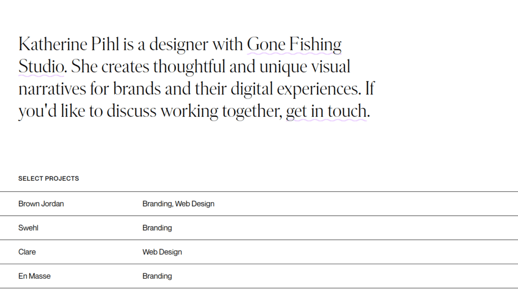
Katherinepihl is a great example of a classic minimal website. The design’s simple and clean, but it doesn’t feel empty or impractical. The white space is really well-balanced, which gives the site a sense of openness without losing functionality. The navigation is super intuitive, so it’s a breeze to move around the site. Whether you’re on mobile or desktop, it looks sharp and works great. If you’re after a well-balanced, minimal design, this site’s definitely one to check out.
2 Huyml
Best viewed on: Mobile
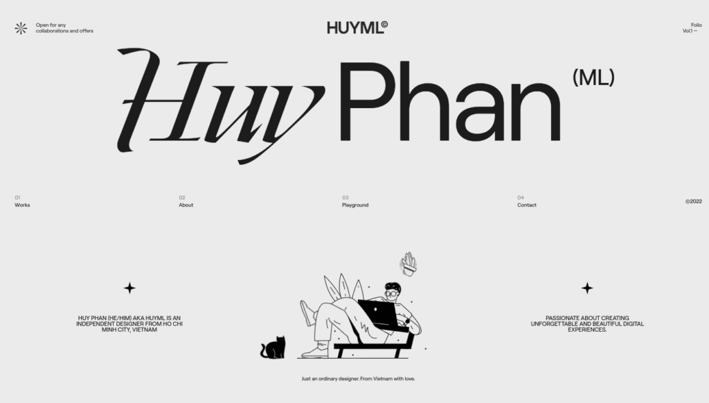
When you enter this site, you’re greeted with an artistic animation that would feel like too much on most websites. But here, it’s balanced out by the simplicity of other design elements, so it doesn’t feel overwhelming. The desktop version is a bit quirky and not super intuitive, mostly because of the vertically centered menu. On mobile, though, it’s much better—the menu’s hidden behind a hamburger icon, making it clean and easy to navigate. This site is a perfect case study how you can mix artistic elements with minimalism without messing up usability.
3 Leonbubova
Best viewed on: Mobile
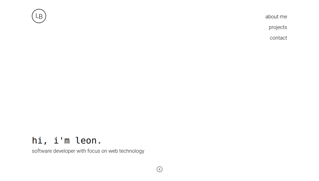
Leonbubova is a single-page site that doesn’t have a lot of content, and that’s a big part of why it feels so simple. On desktop, the layout feels like there’s too much empty space, but the mobile version really nails it. Little touches like the down arrow and space button for navigation make the site feel less empty and add a bit of fun to the design. If you’re just starting out and don’t have a ton of content, Leonbubova is a solid example of how to still get started.
4 Ronanru
Best viewed on: desktop
This developer portfolio site showcases multiple projects built by the developer. It’s designed more like a desktop homepage than a website, which helps highlight the tools the developer has created. Most of the features aren’t available in the mobile version, so it’s best viewed on desktop. Ronanru teaches us an important lesson on how you should break free from conventional designs when other designs are more effective for your use case.

Ecommerce sites
5 Secrid
Best viewed on: Mobile, Desktop
Related post: 14 Best Shopify Websites for Design Inspiration
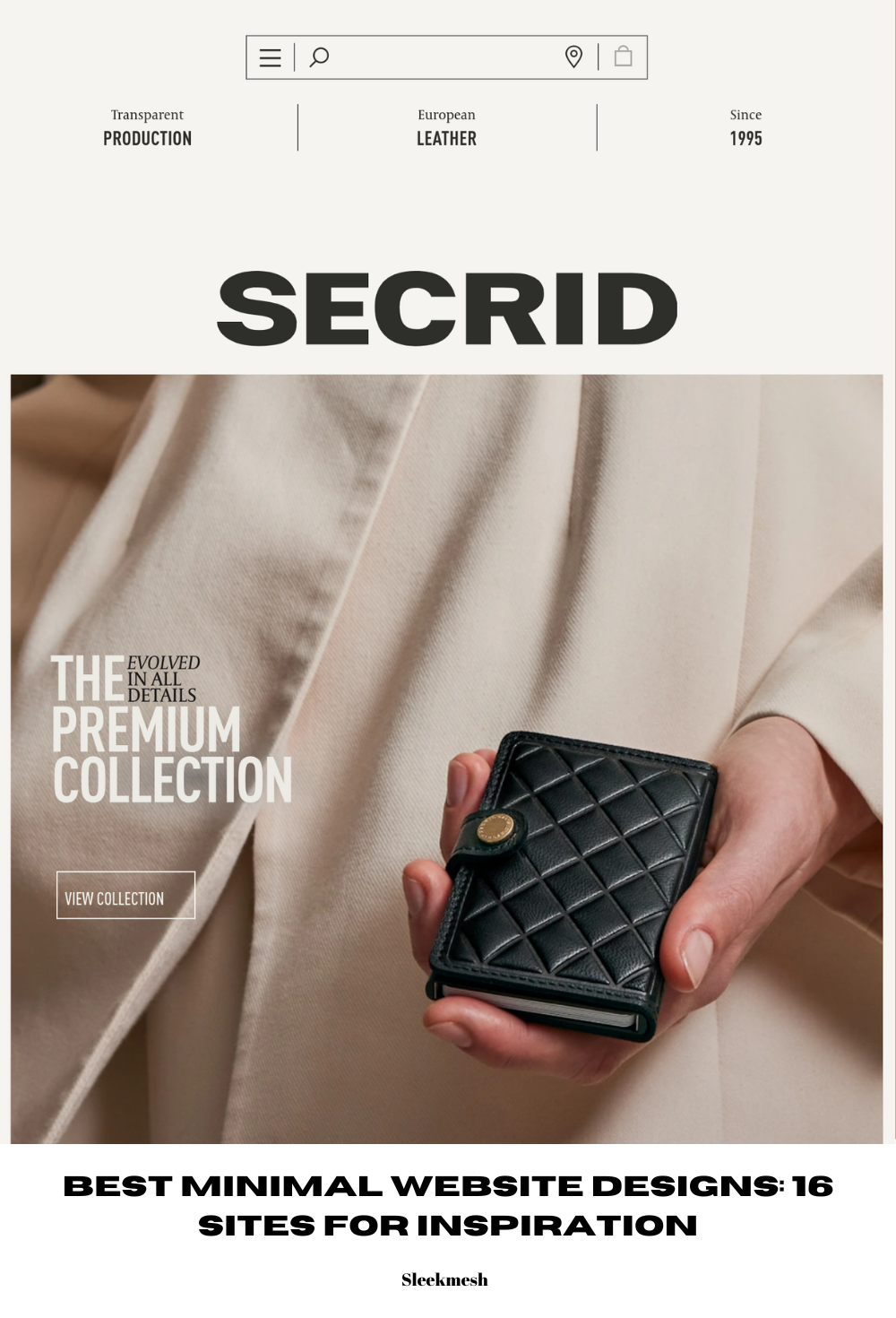
Secrid has the best header design among all the sites on this list. It’s a unique and original header that’s worth noting. The site features a geometric design that is different from current web design trends. There’s a lot of content, but it doesn’t feel cluttered—it’s well-organized. Secrid is a great source of inspiration if you are trying to differentiate and be unique among minimal sites that often share similar traits.

6 Goodmoodprints
Best viewed on: Mobile
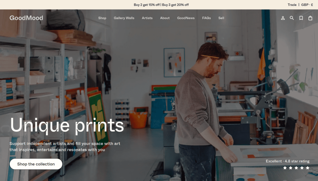
Goodmoodprints isn’t classically minimal, but rather well-balanced in its execution. The site’s design is simple and easy to navigate. While its desktop version is good, the mobile design offers more insights for achieving a minimal aesthetic. This site is a excellent case study on how to strike a balance between simplicity and functionality in e-commerce design.
7 Providerstore
Best viewed on: Mobile
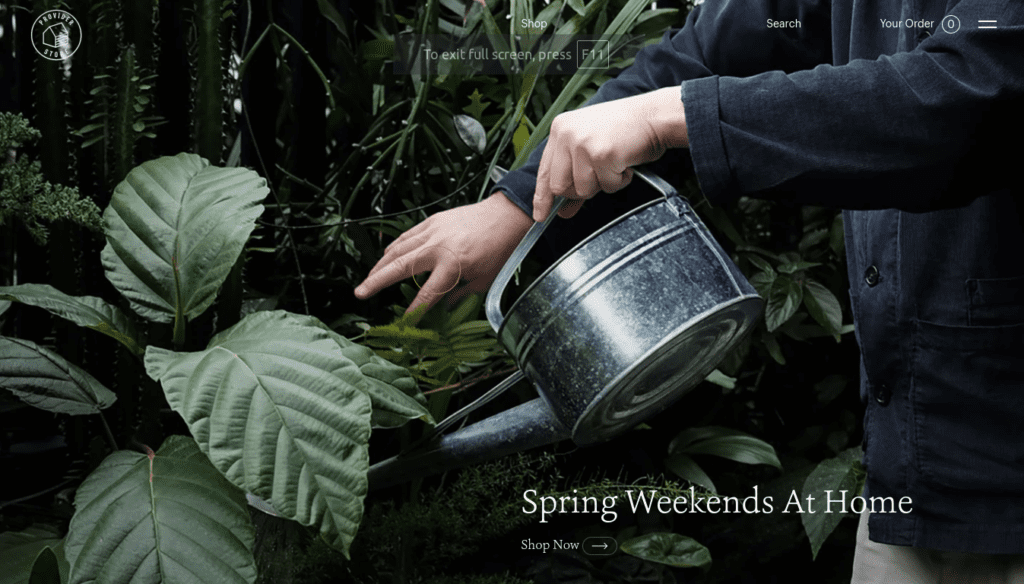
Providerstore tries to bring in Japanese design philosophy in its design. The hero section is the standout of this site, and while the rest of the site is also very well done, the animation in the desktop version is a bit overdone. Except for the animation, this site’s design is really amazing, and if you are going for a Japanese minimal design aesthetic, this could be perfect inspiration.
8 Odiliaflowers
Best viewed on: Mobile
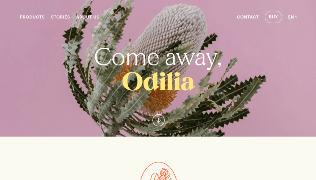
Odiliaflowers isn’t a traditional e-commerce store as it doesn’t sell anything directly online—it only showcases its products. The design is playful, featuring bold colors and rounded elements, yet the site still appears minimal. The fonts are large and clear, making it very easy to navigate. Overall, if you’re aiming for a playful look while keeping the site minimal, this is a fantastic source of inspiration.
Corporate sites
9 Clouarchitects
Best viewed on: Desktop
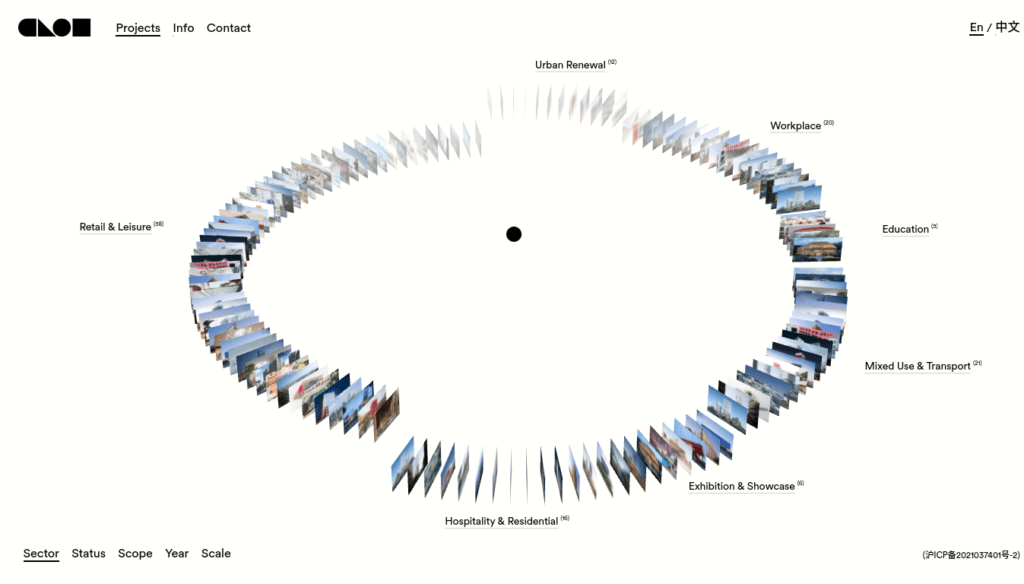
Clouarchitects has the best animation on this list. Everything about the center card animation is as perfect as it can be. The pixels of the miniature cards don’t get distorted as they typically do when downsized, and the mouse tracking has no delay. Despite the heavy animations, the site remains fast. However, the full experience of the animation is only available on desktop. So, to fully appreciate all the inspiration this site offers, you’ll need to switch to the desktop version.
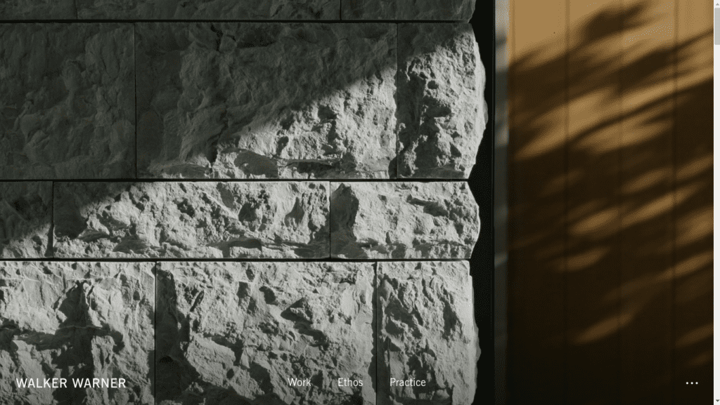
10 Walkerwarner
Best viewed on: Mobile
Walkerwarner greets you with a video in its hero section. The video is high-quality on both mobile and desktop. It’s well-executed on both platforms, but the mobile version offers a more balanced experience. The header design on desktop appears at the bottom of the hero section but sticks to the top as you scroll down. This not only showcases the designer’s efforts but also their original thinking. If you want to take away something from this site, it’s the importance of integrating videos into a website the right way.
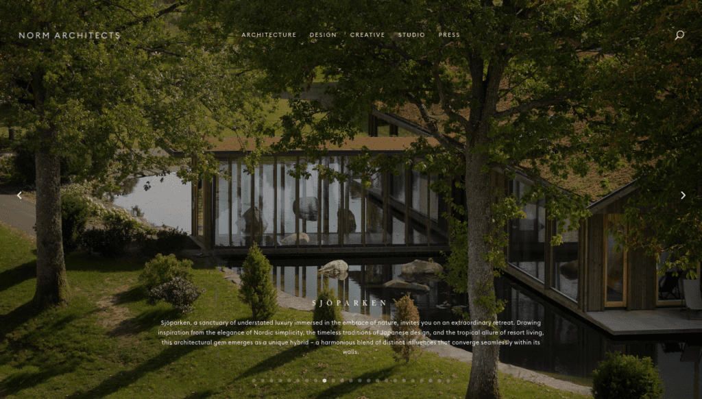
11 Normarchitects
Best viewed on: Mobile
Related post: 15 Business Websites with Effective Design for Business Use Cases
Normarchitects uses three factors really well: typography, photography, and lo-fi videography. The smaller-than-usual fonts play a crucial role in defining the character of the site, while the consistent aesthetic of both the photography and videography adds to it. Their integration of lo-fi video cards taps into current trends in videography. Unlike many other sites, Normarchitects not only nails the basics but also manages to integrate current trends. If you’re looking to incorporate trends in a way that won’t require a redesign everytime there is a shift in those trends, this site offers a great blueprint.
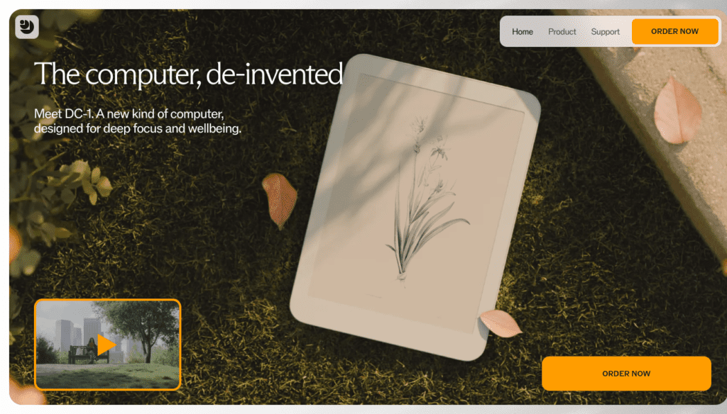
12 Daylightcomputers
Best viewed on: Mobile
Daylightcomputer, as a whole, isn’t very minimal, mainly due to its heavy animations, especially on the desktop version. So, it’s best to view the site on mobile. Despite this, it’s on this list because of how well the individual elements are designed. Each element is crafted with minimal design principles in mind, and if you’re looking for standout minimal elements rather than a fully minimal site to be inspired from, there are many distinct and impressive ones here.
Blog
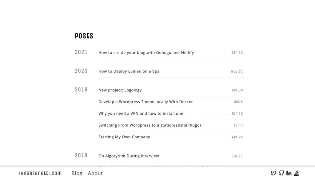
13 Angezanetti
Best viewed on: Desktop
Angezanetti is about as minimal as web design can get. There are no images on this site. Despite having a lot of whitespace, it doesn’t feel empty, thanks to the bottom menu. The accent red color adds character to the site. While there are some responsive issues on mobile, it’s otherwise well-executed on both mobile and desktop. If you’re aiming for a design that’s as minimal as possible without turning it into a basic HTML page, this is the way to go.
14 hespokestyle
Best viewed on: Mobile
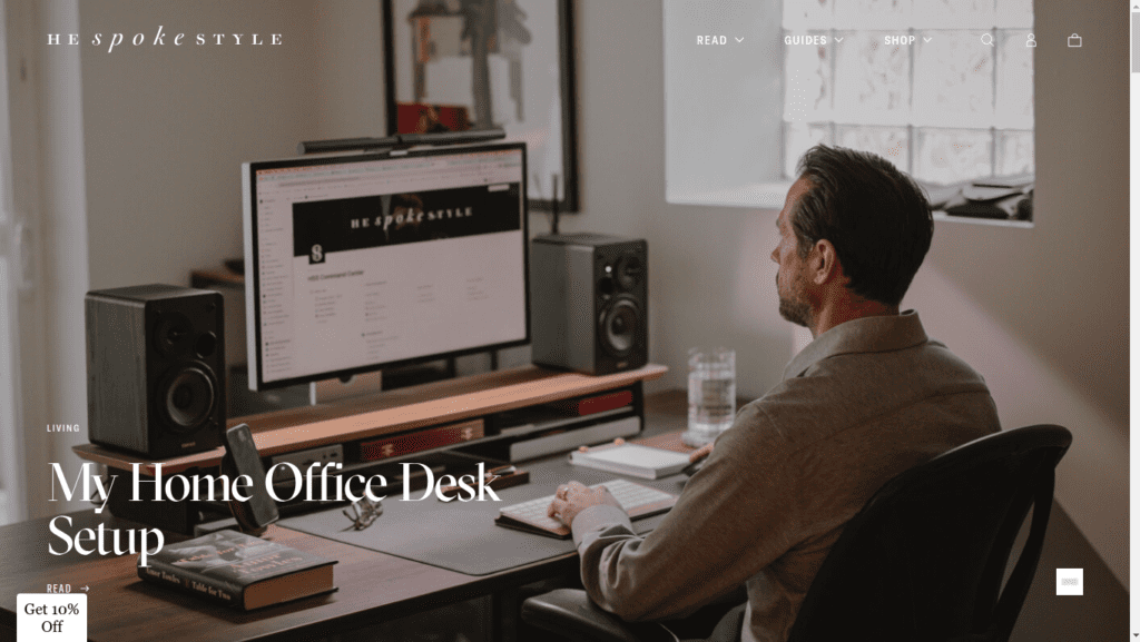
Hespokestyle is more of a typical site than a strictly minimal web design. The effective use of whitespace, along with plenty of content and features kept as simple as possible, earns it a spot on this list. The site overall is clean and simple—there’s no unnecessary fluff. Hespokestyle shows how you can create a modern, content-rich site while still embracing minimal design principles.
15 Wendyrowe
Best viewed on: Mobile
Wendyrowe has a standard blog layout, but what sets it apart from most others is its simplicity. Nothing feels cluttered or overwhelming. The fonts are large and easy to read. While the desktop version has some minor design flaws they aren’t easily noticeable, the mobile version is as perfect as you can get. Overall, if you don’t have much time or aren’t a seasoned designer, Wendyrowe is a great example of how you can take a simple template and, by applying basic minimal design principles, create an impressive site.

16 Kinfolk
Best viewed on: Mobile
Kinfolk has a very detail-oriented design. Small things like the progress bar and the video in the footer are tastefully done. The experience on desktop might feel a little off because of the animation but in mobile it’s well optimized . Overall, they’ve executed the basics really well—everything from the use of whitespace to fonts and images comes as very consistent and clean.

