Almost anyone with a laptop and basic knowledge of WordPress can build an amazing website these days. Making them well-designed is the hard part. And unless you are a web designer, you are always going to be short of ideas to execute it well.
So, in this blog post, we have curated a list of 10 websites from different niches to help you explore and get you designing a beautiful WordPress site.
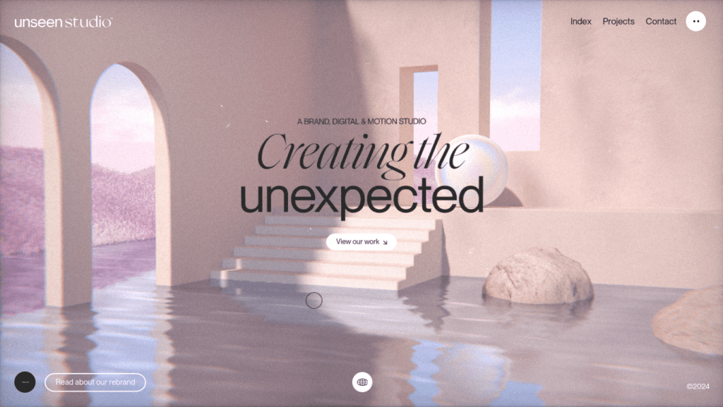
1. Unseen.co
Type: Corporate site
Best part: Audio experience
Related post: Examples of Websites Using Animation for Enhanced User Experience
The fact that a website as well-designed as Unseen exists is already impressive, but the fact that it’s built with WordPress? That’s just remarkable. The design is super artistic, which you’d think might make it hard to navigate, but it’s actually very easy to navigate. The animations are very impressive, to say the least, but the real standout is the audio, especially during hover and transitions. There’s no lag in the audio, which makes the whole experience totally worthwhile. Unseen really pushes the limits of what we can achieve with a simple website builder like WordPress.
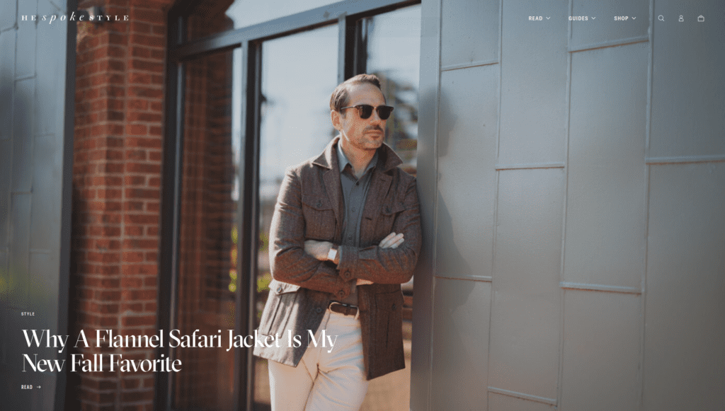
2 Hespokestyle
Type: Blog , E-commerce
Best part: Blog post cards , Photography
Hespokestyle has a really clean and easy-to-navigate layout. They’ve done an awesome job using white space to keep things tidy. All the elements are balanced just right, and nothing feels over the top, even with a few quirky features here and there. What really makes this site stand out is how they use the same plugins—like sliders and cards—as many other WordPress sites, but with way better execution. If there’s one thing to learn from this site, it’s how to use these common plugins in a clean, well-thought-out way.
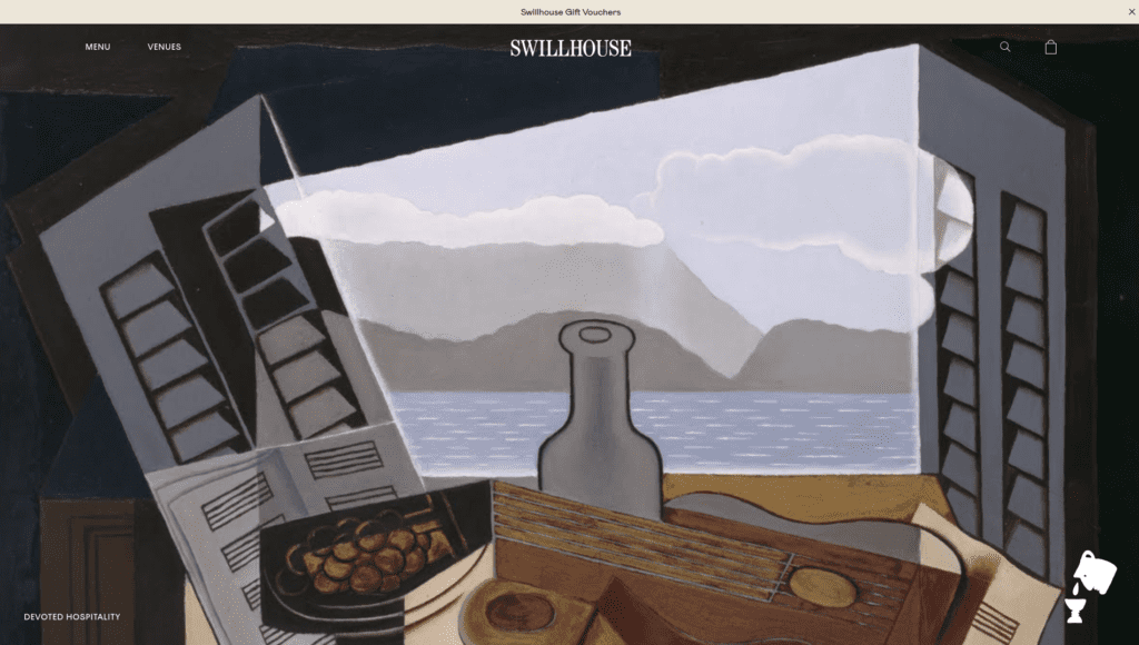
3 Swillhouse
Type: Business portfolio
Best part: Clean UI while being featured packed
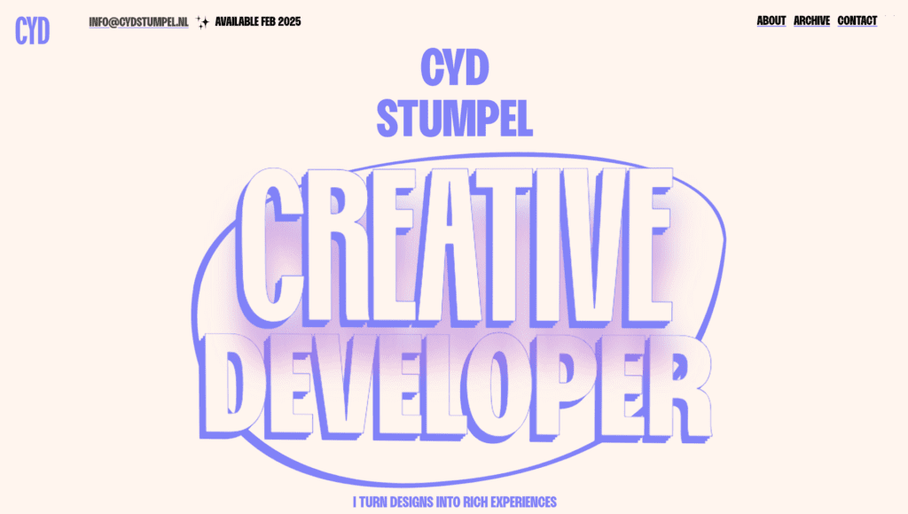
4 Cyd stumpel
Type: Developer portfolio
Best part: Effective use of colors
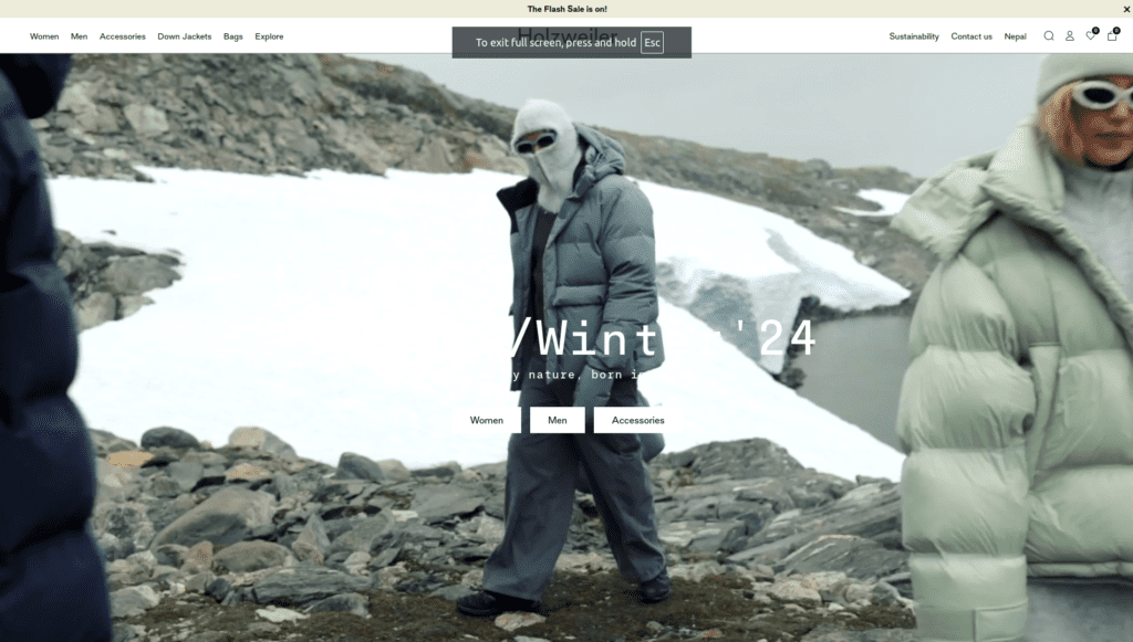
5 Holzweileroslo
Type: E-commerce store
Best part: Homepage
Holzweileroslo might look like any other e-commerce site at first, but it has its own unique personality. A big part of that is the font choice—they’ve exclusively used sans serif fonts for the whole site. It’s a small detail, but it really shapes the personality of the site. Aside from that, the site is simple and clean, and the video in the hero section works smoothly on both desktop and mobile.
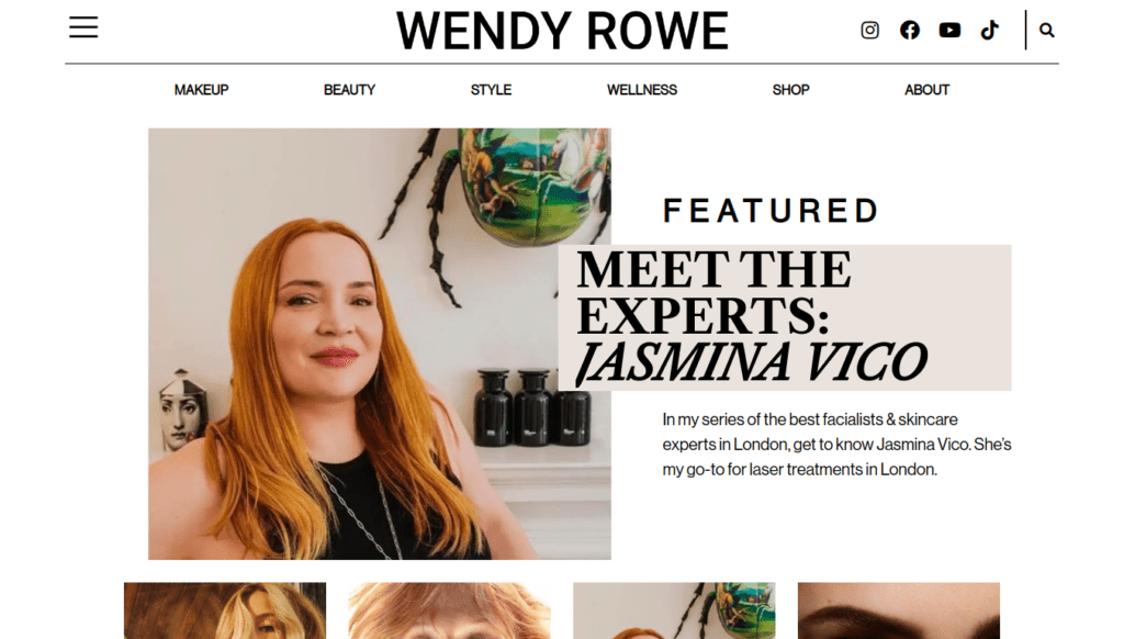
6 Wendyrowe
Type: Blog
Best part: Homepage in mobile
Wendyrowe has a pretty typical blog layout, but what sets it apart is how well it’s executed. While a lot of WordPress blogs look like this one, many end up feeling spammy and messy. The difference here—from those spammy-looking sites—is in getting the basics right—not flashy graphics, just a simple layout, clear fonts, consistent photography, and smart use of colors. That’s it.
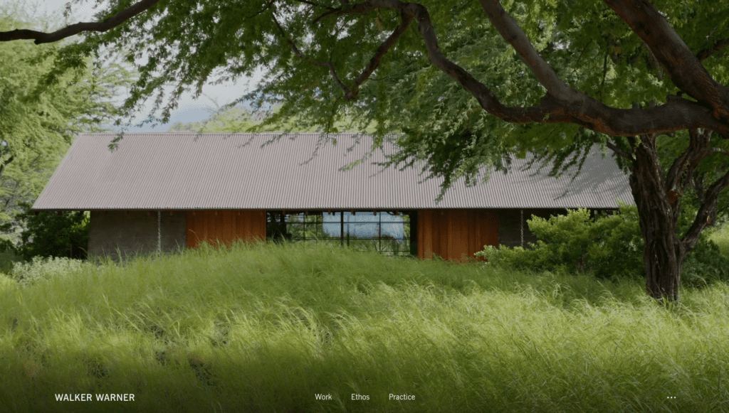
7 Walkerwarner
Type: Corporate site
Best part: Hero section
WalkerWarner features a video right in its hero section, and one common issue with most WordPress sites that do this is high memory usage and slow speed. But that’s not the case here. You’d typically expect a site like this to have a memory usage of at least 200 MB or more, but WalkerWarner doesn’t even hit double digits. This is crucial when using WordPress, as many sites either go all out with great design but end up being slow and heavy on memory, or they sacrifice design quality for speed. There are plenty of great sites on this list, but if you want to see how to balance high-quality design with solid optimization, look no further than this one.
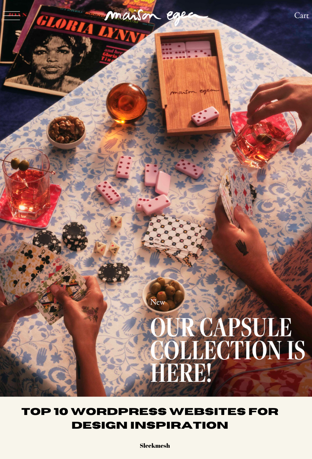
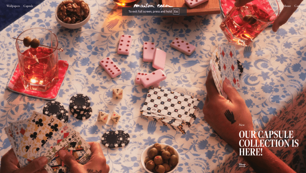
8 Maisonegea
Type: E-commerce store
Best part: Homepage in mobile version
Related post: Top Minimalist E-Commerce Websites for Design Inspiration
Maisonegea features a very minimal design. At first glance, it may not seem minimal; it appears more artistic. However, as you explore the site, you’ll see it primarily uses black and white colors, simple text, and just the necessary elements—nothing more. Much of the initial artistic quality comes from the wallpaper patterns in the images throughout the site. This shows just how much they rely on images to shape the personality of their site. But without the consistent patterns across almost every image, this wouldn’t be possible. Maisonegea is the perfect example of how you can rely heavily on images, and as long as the images are high quality and follow the same aesthetic, it totally works.
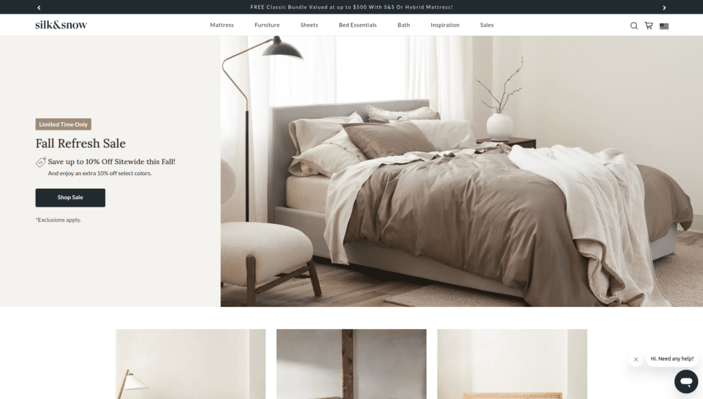
9 Silkandsnow
Type: E-commerce store
Best part: Product page
Most e-commerce stores these days are built on Shopify, so finding a good WooCommerce site like Silkandsnow is rare. The layout is super clean and simple, with accent colors used throughout. The product page is definitely the standout part—it’s packed with content but still feels really organized. If you’re looking to build a WooCommerce site that fits with today’s design trends, Silkandsnow is a great example to check out. Especially when most WooCommerce sites look pretty outdated.
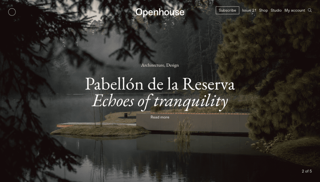
10 Openhouse
Type: Digital magazine , E-commerce store
Best part: Product page
Openhouse is a solid example of how sticking to design basics and using high-quality photos can have a big impact on a website’s look. Smart use of white space and fonts does a lot of the heavy lifting for this site’s design, while the photos tie everything together. Consistency in the images is probably the best part; all the photos share the same aesthetic. Openhouse shows that paying attention to small details is way more important for great design than relying on a few flashy elements.
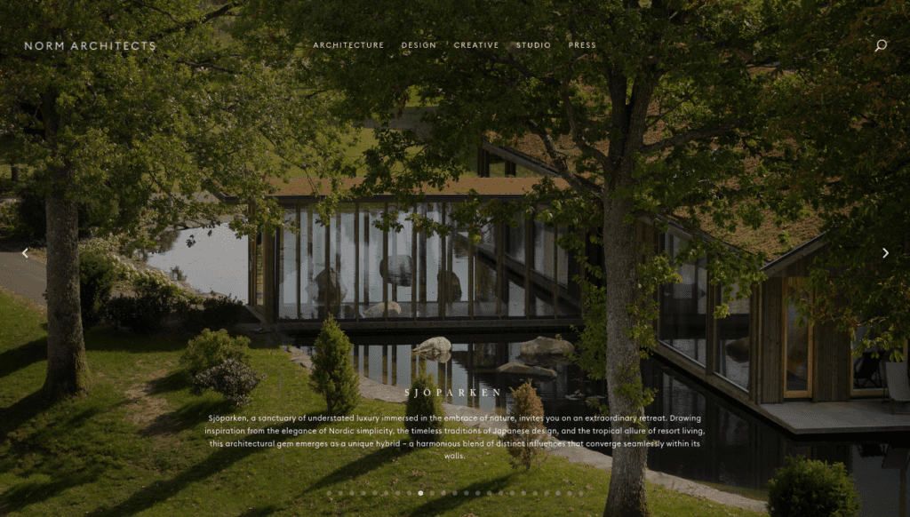
11 Normarchitects
Type: Corporate site
Best part: Good use of Typography
Normarchitects is yet another example of how influential fonts are in the design of a site. They have relied heavily on typography to define the character of their site. Aside from the font, the layout is familiar, just executed really well. The slider in the hero section and the video cards are among the standout elements. While sliders in WordPress sites often feel overdone, this one strikes a perfect balance without sacrificing design appeal. The video card is a rare feature, and among the many WordPress sites I’ve reviewed, this one stands out as the best example. If you’re looking to create a simple site but want some standout elements here and there, this site serves as an excellent case study.
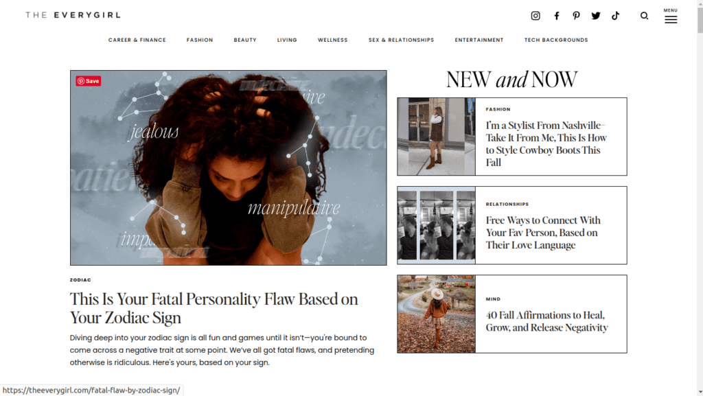
12 TheEverygirl
Type: Blog
Best part: Use of borderlines
TheEverygirl is a great example of how a single element—borders, in this case—can be used effectively to define the personality of a site. The borders really define the site’s character—without them, it would look like any other typical blog layout you’d find in a lot of templates. For anyone who is a beginner at WordPress and prefers to stick to a basic template design but still wants to give their site a unique twist, the use of borders by this site is something you could draw inspiration from.