Almost 26% of all global e-commerce happens through shopify sites . That’s millions of businesses generating billions in revenue every year. In such a highly competitive market, a well designed site isn’t an after thought – it’s a must.
So, we’ve handpicked 14 sites from thousands we reviewed that you can use as design inspiration to help nail the perfect look for your own store.
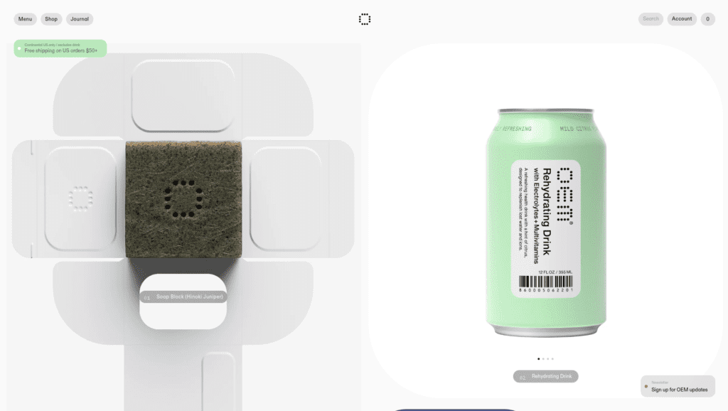
1 Oem care
Product category : Drugstore
Defining feature: Rounded elements
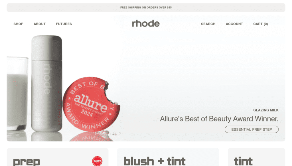
2 Rhodeskin
Product category : Skin care
Defining feature: Boxed design
If you’re viewing this site on desktop, you should switch to mobile. While the desktop version is great, it doesn’t compare to the design of the mobile version. The first and most noticeable detail is its boxed design, which is quite different from most other boxed layouts that typically only contain text or elements. Here, the entire site is boxed with a noticeable amount of space outside it. Aside from that, the design is fairly standard; it’s that one bold choice that gives the site its character. This site illustrates how sometimes it just takes one bold design choice to set your site apart from the rest.
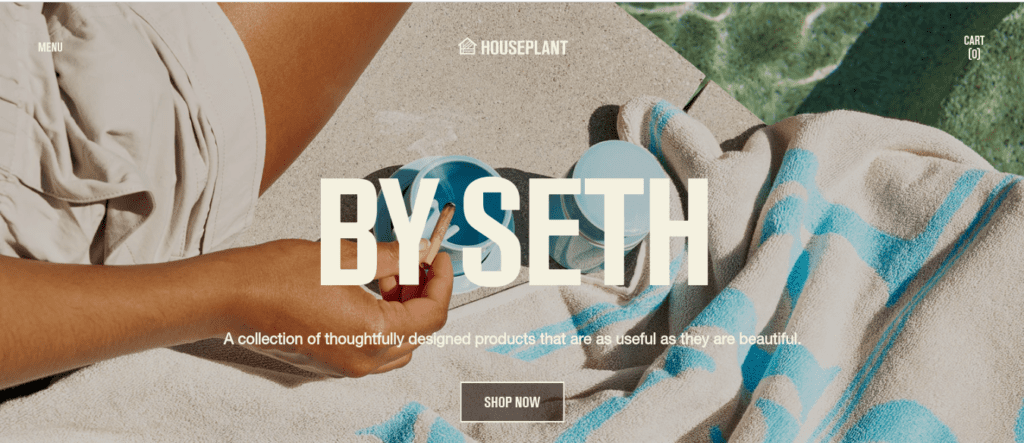
3 Houseplant
Product category : Smoking accessories and home goods
Defining feature: Product images blending with the site’s background color
The first thing that stands out about this site is its full-width design. While many sites today prefer a boxed layout, this choice clearly sets them apart. There are two other standout features: the way pictures blend with the background and the thoughtful use of color. Often, photos blend the background unintentionally, usually with white backgrounds, but here, it’s done intentionally and executed perfectly, especially with the shadows. Another noteworthy detail is the use of rating bars in the comment section. This clean yet clever feature not only keeps comments concise but also allows users to provide more personalized feedback. With so many impressive details throughout the site, it’s hard to pinpoint just one key takeaway. However, if I had to sum it up, I’d say it’s a perfect example of how to be bold without overdoing it.
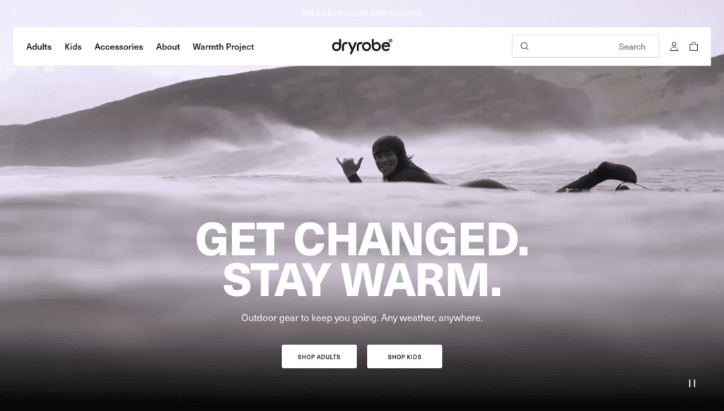
4 dryrobe
Product category : Sustainable outdoor accessories
Defining feature: Product focused videos
Dryrobe is a very simple site. It looks exactly like what you’d expect from an e-commerce website. However, one thing they’ve done really well is video integration. If you try to picture the site without the videos, relying only on plain photos, you’ll realize just how much of an impact the videos have. They play a huge role in shaping how customers feel about the brand. So, if there’s one takeaway from this site, it’s that if you’re struggling to convey the right emotions about your brand, adding videos can make all the difference.
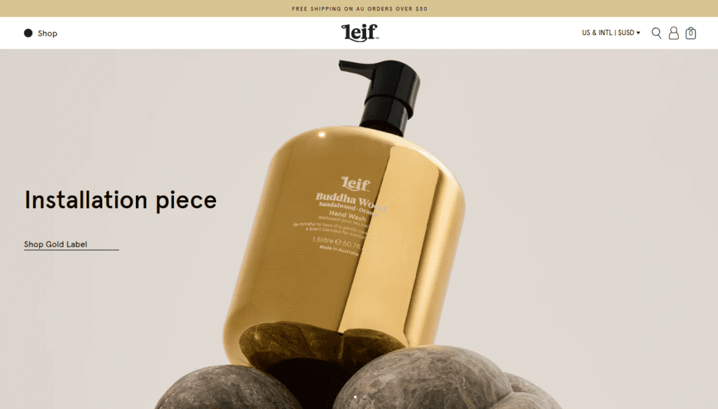
5 Leifproducts
Product category : Personal care
Defining feature: Use of photography
One thing you’ll notice as soon as you enter this site is the rich accent color, which appears consistently throughout. But if you look closely, you’ll see that the accent color isn’t used much in the design itself. Instead, it’s carried through the product photography. This is a crucial detail because often we rely heavily on design elements to meet our needs, but here, the design elements are simple, and it’s the photography that stands out. This not only works well for the site but also helps maintain brand consistency, as those photos are likely used across other platforms. If there’s one key takeaway from this site, it’s how to effectively use photography to elevate design.
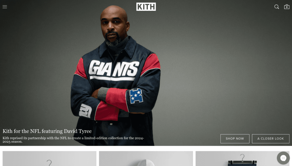
6 Kith
Product category : Clothing
Defining feature: Homepage is completely call to action only
Kith’s homepage can be summed up in just two things: call to action and product images. Each section features a product image with a call to action button, and everything else is kept as minimal as possible. This minimalism is especially noticeable in two areas: the header and the use of white space. The site uses a full-width layout, effectively utilizing that space while maintaining just enough white space to prevent the sections from feeling overwhelming. Similarly, the header is transparent, and they use a hamburger menu even on the desktop version. This shows that, as an e-commerce store, the main focus is on getting people to buy, and designing the site to guide users to the checkout page as quickly as possible is all that really matters.
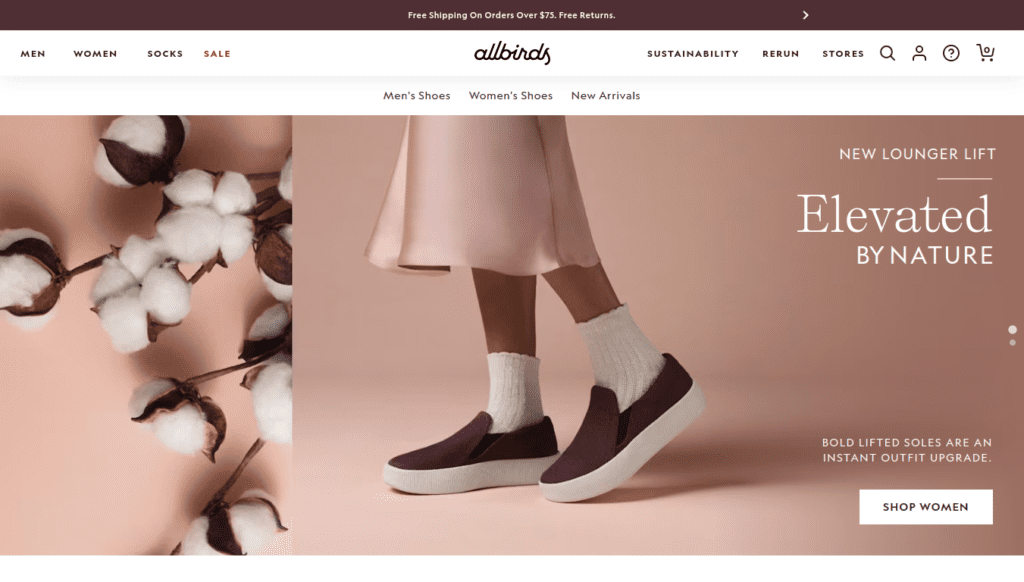
7 Allbirds
Product category : Footwear
Defining feature: Simplicity of layout
Allbirds isn’t just another e-commerce store; it’s a publicly traded company. And for such a big brand, their design is as simple as it gets for an online shop. Similar to Kith, their homepage is packed with call-to-action buttons, with just one section breaking the trend. The buttons are super large, especially on mobile, making them the main focus in every section. Everything else is kept simple so users can take action quickly. It’s a solid reminder that keeping things clear matters way more than trying to be flashy.
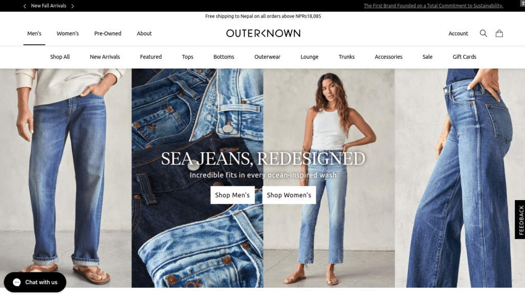
8 Outerknown
Product category : Sustainable clothing
Defining feature: Mobile version
Outerknown starts with a simple yet unique hero section. The homepage is kept clean, with no unnecessary elements that many sites include just for the sake of it. This simplicity extends to the product page, which features a common, intuitive layout—nothing feels overdone. One downside is the cookie policy: the site only offers an option to accept it, and if you don’t, the notice stays visible the entire time. This could be improved. Aside from that, the site is a great example of how small details can create differentiation without needing excessive or flashy design elements.
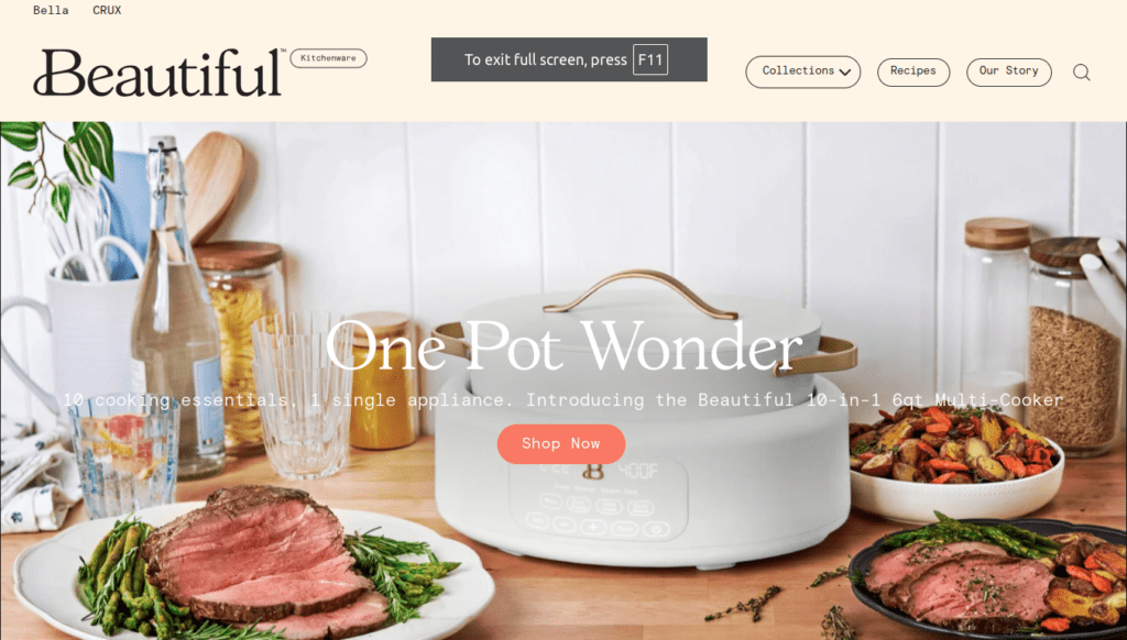
9 Beautifulbydrew
Product category : Kitchenware
Defining feature: Handcrafted aesthetic
Most of the sites in this list have a polished, professional look, but Beautifulbydrew stands out with a more organic and handcrafted aesthetic. The accent colors are playful and boldly applied. The mobile version is excellent, but the desktop version could use some improvement due to several layout issues that need fixing. Aside from that, the layout is kept minimal, with the bold colors doing most of the heavy lifting in the design. If you’re aiming for a playful, laid-back, and more personalized style, this site could serve as a great source of inspiration.
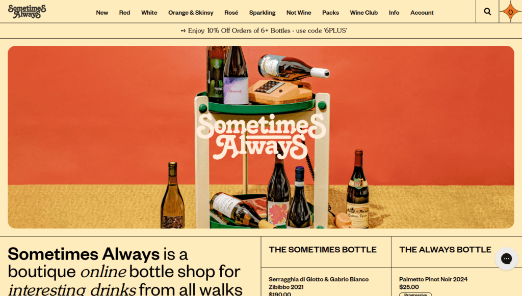
10 Sometimesalways
Product category : Beverage
Defining feature: Graphics and colors
Sometimesalways excels at balancing bold colors and graphics. This balance is primarily achieved through its earthy-toned background, which softens the vibrant elements. The site features a full-width layout similar to Houseplant, and despite its flashy appearance, it remains minimal, especially in the mobile version. Overall, if you’re looking to design a minimal website that breaks away from the typical black-and-white palette while adding a playful touch, this is a fantastic case study.
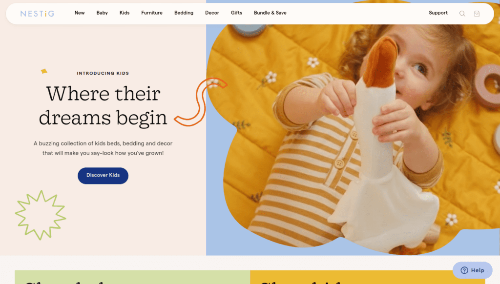
11 Nestig
Product category : kids furniture
Defining feature: Animation in graphics
Related post: Examples of Websites Using Animation for Enhanced User Experience
Nestig is a kids sites , so they have used graphics and photos to make the site playful. They also added animation to the graphics. Similar to those animation they have small details that you could notice throughout the site. I personally though like how they have designed the category page . It is a simple layout but the page manages to look both playful and minimal at the same time.
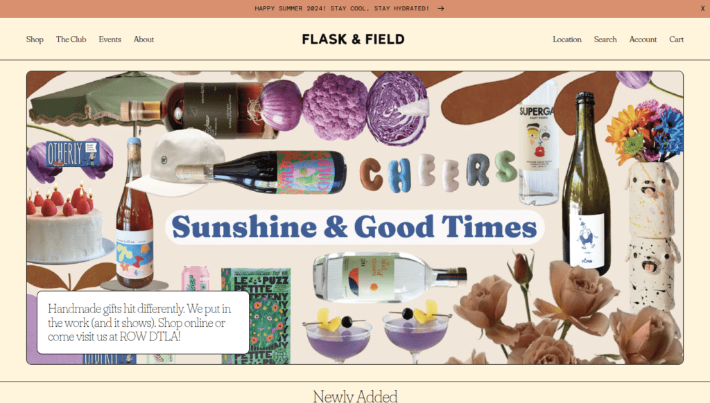
12 Flaskandfield
Product category : Beverage
Defining feature: Use of borders
Flaskandfield has very maximalist design. Everything—from colors to fonts to borders—is made to stand out. Despite this, it still looks balanced, especially on mobile. This balance comes from the borderlines; the site has a lot of content and elements, and without the borders, it wouldn’t look as good. This site clearly shows how borderlines can be used effectively to give a site a cleaner and more structured look.
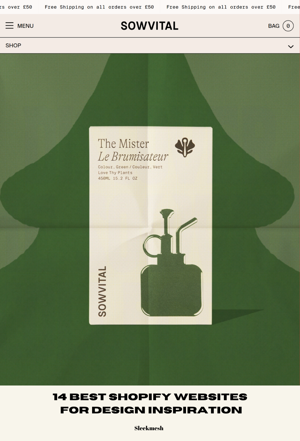
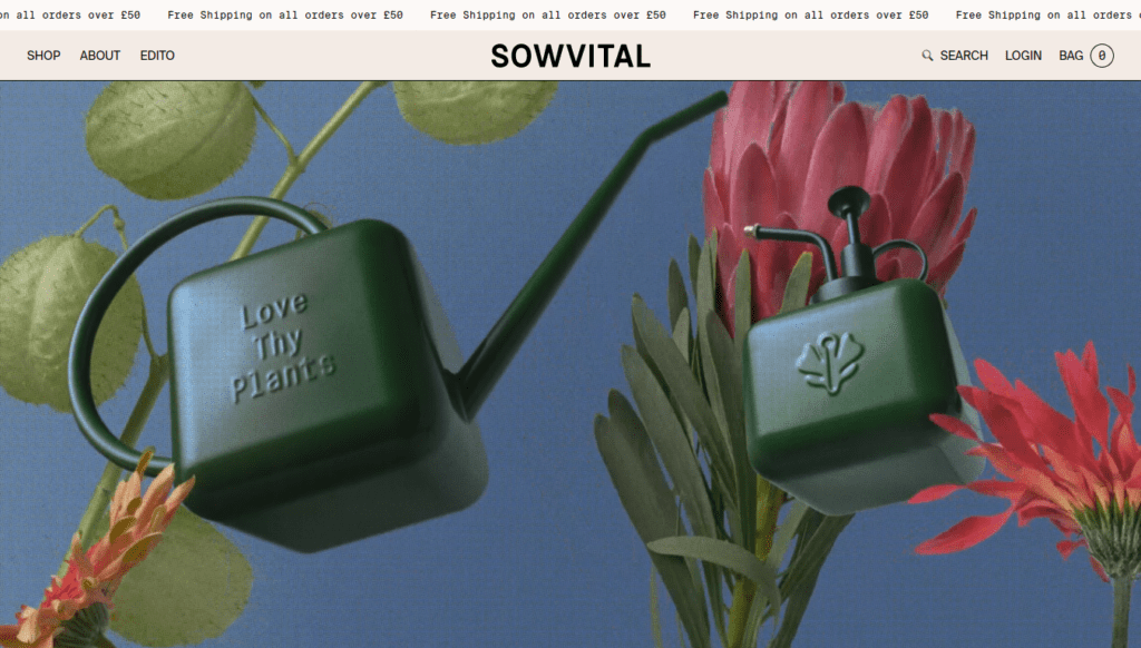
13 Sowvital
Product category : Horticultural products
Defining feature: Product photography
Sowvital does two things really well. First, it uses photography to define its brand colors, and second, it uses fonts in a subtle and effective way. As soon as you enter the site, it’s clear that their brand color is green. However, if you look closely, there aren’t many green elements; it’s mostly the product photography that defines it. We saw a similar approach with Leif Products, so if you’re unsure about relying on photography too much, this should give you the confidence to give it a try.
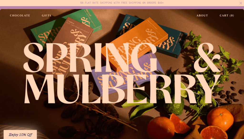
14 Springandmulberry
Product category : Chocolate
Defining feature: Color palette
We’ve seen other sites with bold color usage on this list, but none as bold as Springandnulberry. Considering this is a chocolate brand, the bold colors fit perfectly. Besides the colors, everything else is kept simple, allowing the colors to really stand out. It’s a great reminder that being bold works as long as you don’t have multiple bold elements competing for attention. Overall, if you want your site to feel fun but still professional, this is a great source of inspiration.
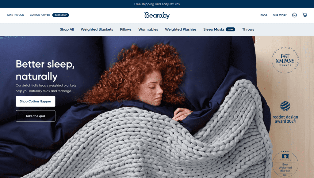
15 Bearaby
Product category : Weighted blanket
Defining feature: Use of accent colors
Bearby’s use of accent color is perfect in every way. You’ll notice different shades of blue throughout the site, but they never feel overwhelming. Another standout feature is how well they’ve integrated customer review videos. While many sites simply add these videos without much thought, Bearby has optimized them to enhance the user experience. This offers an important lesson: people value genuine feedback more than any design element, so when you incorporate and optimize customer voices effectively, it will add more value than any design can .